Retail UX: how to improve profitability through experience - HMY Group

Retail UX: how to improve profitability through experience

"Most of Retail bases the design of its shops and supermarkets on maximising the visibility of products"
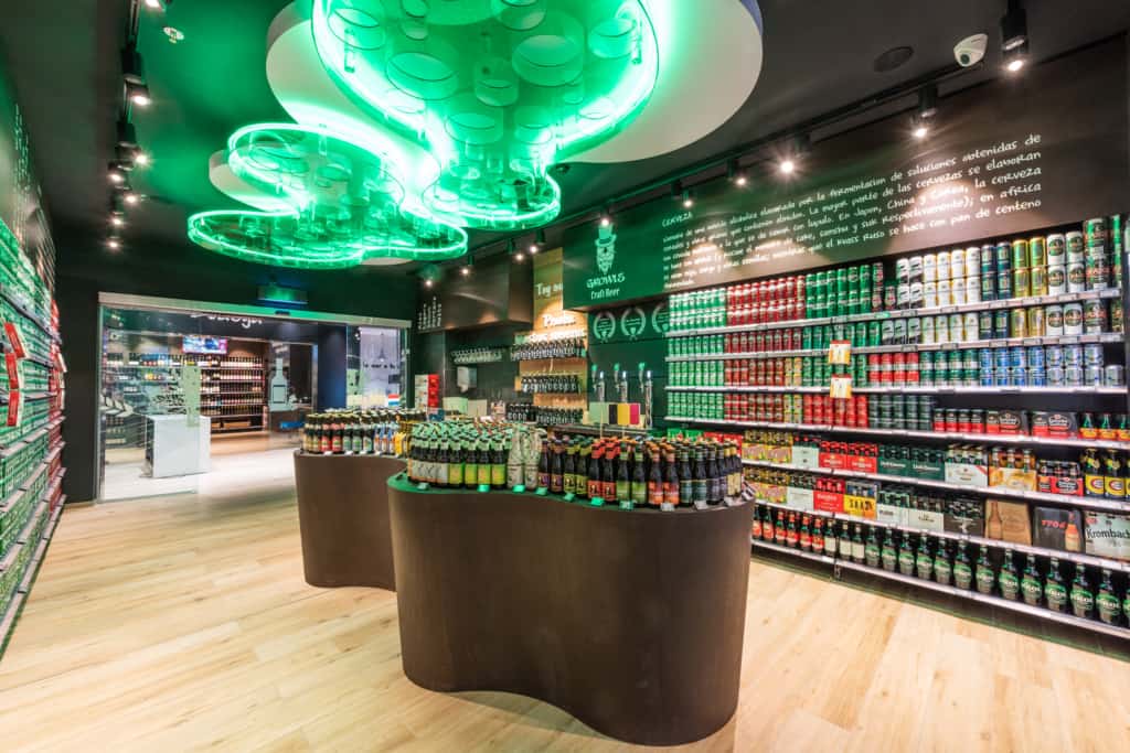
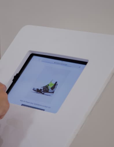
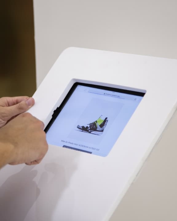
El corte inglés concept store

Redefining the new digital experience of one of the brands.

See the case

Most of Retail bases the design of its shops and supermarkets on maximising the visibility of products, highlighting and guiding the user to the products that we are more interested in selling, and using other products as a vehicle to this end.

It is a “product-centric” model that relies entirely on the functional aspect of Retail -the acquisition of goods-.

A model that would have to be considerably improved if we were to design the point-of-sale with customers’ needs in mind when interacting with the products and not only to maximise sales.

In other words, if we add a layer of “usability” to traditional commerce, we will be giving our points-of-sale clear differential compared to the competition, to the point where the user will prefer to visit our centres because they are more experiential.

What if we approached the design of shops or supermarkets from the perspective of “usability”?

The user experience or UX is a great asset of eCommerce profitability.

The main lesson from online to offline: User Experience

If in the previous paragraph it seemed that we were talking about a mobile app it is no coincidence, because we have introduced the two basic concepts of eCommerce: the user and usability.

Usability is part of a greater art: User Experience (or UX). The former focuses on the ease with which consumers can achieve their goals, while the latter, through usability and other disciplines, seeks to provide an agile, memorable and differentiated shopping experience.

It may seem obvious, but even in the digital world it is something not fully mastered by all players, despite its business-critical nature.

According to Forrester Research’s Customer Experience Index, usability can make a 77% difference in sales between apps that master it and those for which it is not important.

How do we apply usability to Retail?

The theory is logical and simple and, even better, it is complementary to traditional product distribution without making too many changes. In essence:

Identify the Customer Journey of each type of customer.

Analyse the difficulties they encounter at our points-of-sale and how we can improve their shopping experience.

5 elements for improving usability at the point-of-sale

Once consumers and their main problems have been identified and quantified, we will implement solutions to these “friction points”.

Here are 5 categories that we can focus on to improve consumers’ shopping experience to increase their loyalty and, probably, increase both their recurrence and their average ticket:

1. Designing an accessible shop layout

Solving some problems is as simple as rearranging some sections. It can even give us ideas about new areas, or how to desaturate our points-of-sale.

Reorganising a commercial space is no small feat, especially if some sections depend on specific infrastructure, but doing so can even increase the average ticket.

For example, if the order in which the consumer reaches certain sections means that the most fragile products end up at the bottom of the basket, customers will be more reluctant to fill them. Or if our planogram is uncomfortable for them to navigate, shopping will give them a bad feeling.

2. Making shopping easier for people with special needs

Approximately 27% of the population has some form of temporary or permanent motor impairment and some 70,000 people are legally blind. This is just to mention two of the most obvious problems.

A nontrivial part of the population who face the daily hardships of a world designed without them in mind, when in fact helping them to shop at our points-of-sale requires little effort and makes a big difference.

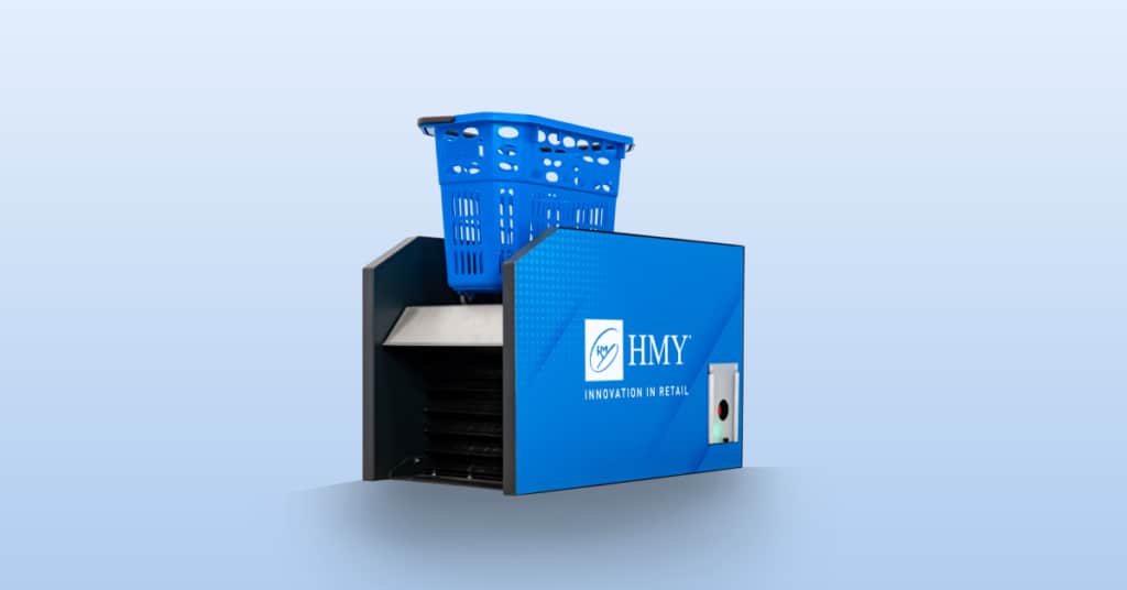
Braille signage to identify sections or support systems for people with lifting difficulties such as HMY’s Basket Lift are two clear examples.

3. Visual Communication and Digital Signage

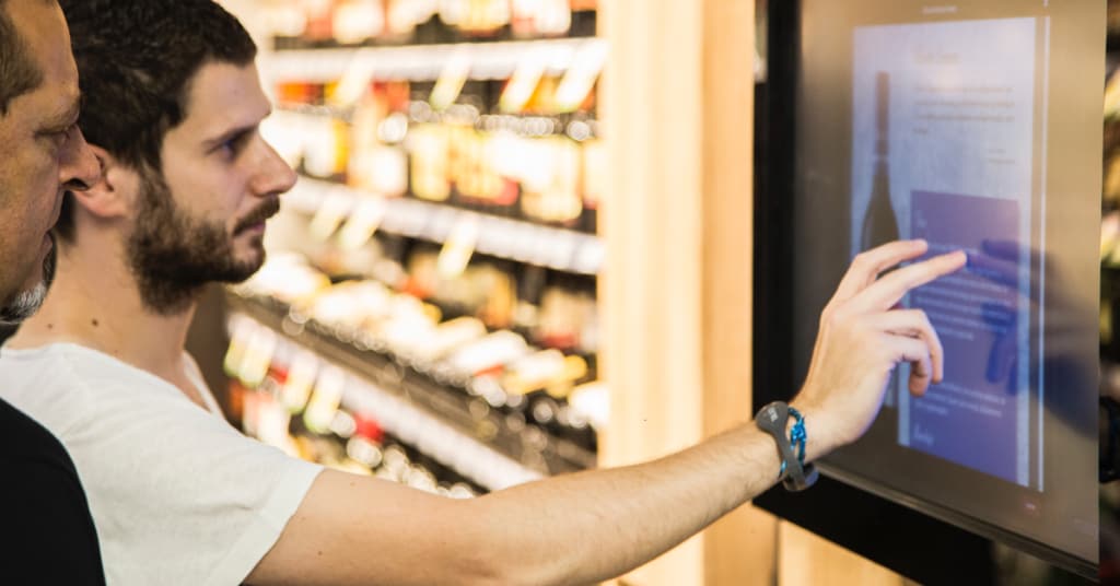
In increasingly complex points-of-sale, consumers’ need for information has grown proportionally. Searching for this information (where a certain section is, how long until it is my turn, specific questions about the product, etc.) is frustrating for users and hinders the staff, who do not always have the answers.

Locating the most frequently asked questions and answering them through visual communication or digital signage provides immediate relief and a better experience for consumers. Here are some quick ideas:

Advice on the ideal shopping time or how to combine it.

Information about fresh product groups is visible in all sections.

Showcase the value of the product’s origin, such as designations of origin.

4. Accessories that improve traffic flow inside the shop

How comfortable is it for the customer to move around the point-of-sale? We have made great strides by changing the layout and improving graphic and digital communication, but there are still areas where we can improve the customer’s experience by thinking of more efficient ways for them to transport products or avoid queues and saturations:

Rethinking whether our available space, the layout and the most common type of shopping would be more comfortable with a trolley, a basket or a mixed model.

Facilitating traffic flow and avoiding congestion with shift management and capacity control systems.

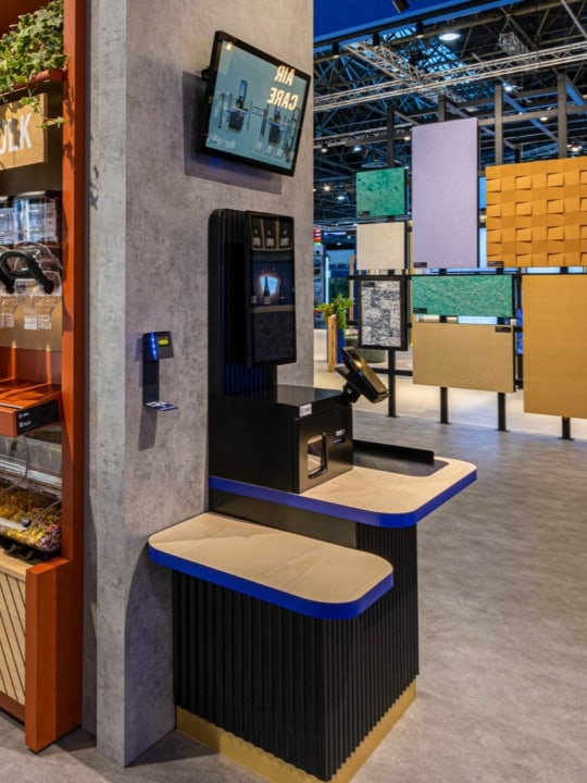
Combining traditional checkouts with compact self-checkout models.

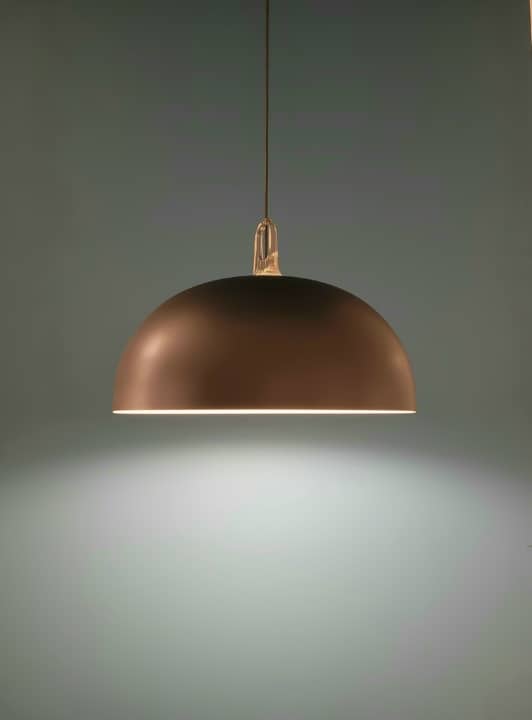
5. HCL and specific product lighting

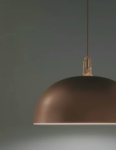
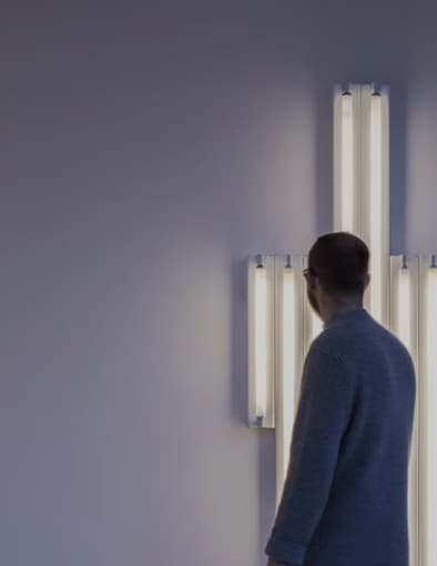
Lighting has become incredibly diversified and professionalised in the last five years. So much so that every day more and more brands and distributors understand the importance of not lighting everything in the same way.

The general lighting should be consumer-friendly, avoiding high contrasts and dampening the difference with outdoor light as much as possible.

Furthermore, product lighting should focus on the most important aspects of the product, such as:

The meat section should highlight the red colours.

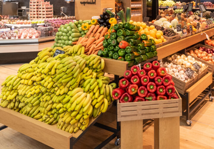
In the fruit and vegetable section, a warmer light boosts the feeling of being in a sunny orchard.

A cold light in the fishmonger’s section reinforces the feeling that the products are fresh from the sea.

As you can see, there are different options that we can use to improve the user experience at the point-of-sale so that they have a comfortable, simple journey that can help them resolve pain points.

This is what we discovered

We advise you on the best solution for your project.

Because we put our heart wherever your project is.
Because we create, think and design unique spaces.
Because we are the global-local partner you are looking for.

Let's Talk
Let's talk